Traffic Sign Classifier
Term 1 Project 2 Udacity Self Driving Car Nanodegree
Project 2 didn’t sound too bad. Just take 40,000 images of German Road Traffic Signs. Train the computer to recognise them. Achieve 93% accuracy on a few thousand samples. Use Google’s Machine Learning Framework , TensorFlow and someone called Yann LeChun might provide some inspiration.
How hard could it be? ………. Let me put it this way when you can see road signs in your sleep you’re about half way there!
So what exactly are these images? The German Traffic Sign Benchmark collection of around 40,000 images of more than 40 types of road signs. It was created for research purposes and presented at the International Joint Conference on Neural Networks (IJCNN) 2011. This has become a goto resource for people learning about image classifiers because it is large enough to support research and with enough variety at over 40 types of signs to be a realistic representation to the kinds of signs we need to be able to recognise for self driving cars or similar applications. It has risen to the status or rite of passage for aspiring Self Driving Car Engineers.

Above is a sample of 5 different road signs from the Dataset. You can see for yourself some of them are very dark and some of them have clutter in the background. The data has not been selected to make it easy. Below are a selection of 5 signs of the same type. Some are bright some, dark, some with partial other signs included. So this is a realistic and credible dataset constructed to be a genuine challenge and the basis for a useful learning experience.

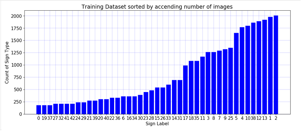
Being an exercise in working with big data never miss an opportunity to visualise your data set! Above is a histogram to illustrate the variations of occurrences in the data set. The road signs types are labeled 1 to 43 and the occurrences range form around 100 to near 2000. I arranged the data in ascending order and with this arrangement a few things become obvious. At a glance we can see around one quarter appear between 100 and 250 times, one quarter between 250 and 500 times , one quarter appear between 500 and 1250 , one quarter above 1250 and less than 2000. The question arises as to whether or not there are implications for the performance of the classification of the data sets and the number of example of each type. The short answer is yes and this question gets explored later.
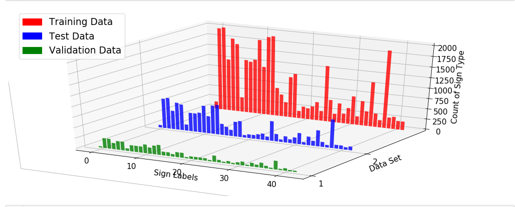
Below is a 3D graph to represent the data set as divided into 3 subsets for Training , Testing and Validation. The data was randomly spit and presented to the students as a “pickle” file which is a file that contains many subfiles. We can see from the graph that the spiting process has maintained the nature of the distribution of data ie high points and low points in each of the graphs is similar and each subset reflects fairly the nature of the original data distribution.
Did you know in IT we love to draw rectangles and squares? That’s because we are often describing a sequence of abstract ideas or steps so we end up drawing rectangles top to bottom or left to right to illustrate how data is processed in steps. Above is perhaps more squares and rectangle than you have ever seen in one diagram. That’s because machine learning is complicated! This diagram is one of the most influential and pioneering in the field of machine learning and object recognition or classification. It is the now famous LeNet Convoluted Neutral Network. This was used to recognise handwriting on bank cheques back in 1998 and represented a major step forward at the time. In this project we implement this diagram using Googles Tensorflow and that is where we start from. We can add or subtract from this or make our own model entirely but we study LeNet to see one famous good example. LeNet tends to be used in image recognition as used here but can be the basis of other applications. In project 3 I see how LeNet does at driving a simulated car and it actually does reasonably well.
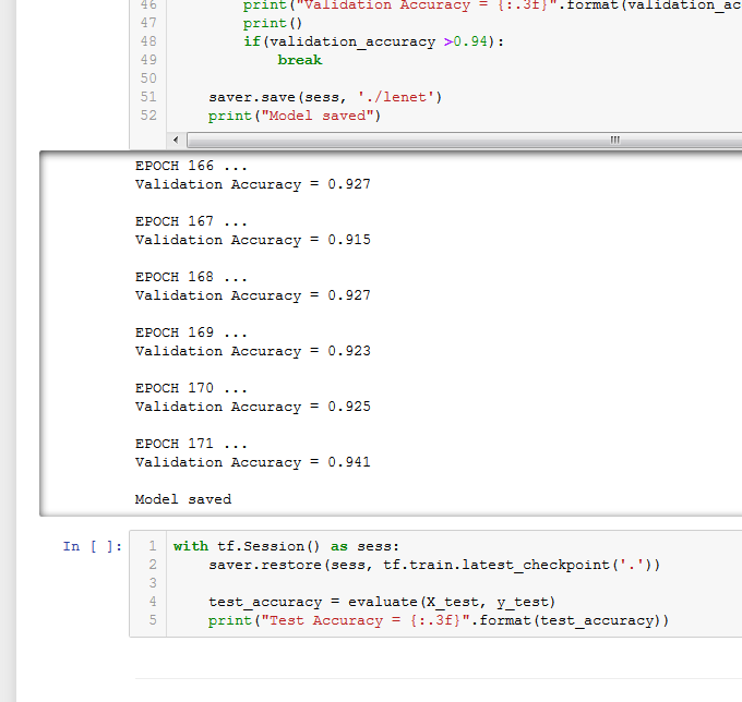
Machine Learning Programs run in cycles called an Epochs. Gradually performance improves over several epochs. Typically they peak and plateau at some points . There is an element of randomness to the process. For example the image on the left shows the model ran 171 times and hit 94.1% accuracy on the test set. This is because I set it to stop when it got better than 94%. However on the right you can see exactly the same program running again and this time it hit 95.4% after 134 Epochs. In the second example I let it run for 200 to see how it would do and it plateaued from around epoch 150 onward.
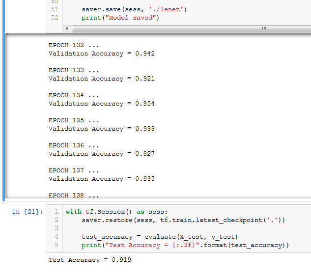
The random variability is expected and even desirable. We randomly shuffle the data before each use and the process itself has a random element to it. Remember we are really trying to create systems that can work in the very random world of real life so we need to create systems that can handle random variation. In doing so we will not get precisely the same result every time we run a program like this.
So how did it do? Overall without modification to the LeNet process or doing anything to the Dataset I got a score of about 89%. Not enough to pass but a good start. I noted from the community that many people were modifying the LeNet process or creating their own process to improve the results. Out of curiosity to see how good I could do just using LeNet I decided to focus on the other recommenced approach which was to use data augmentation to improve the result.
Data Augmentation means adding to or modifying the original data set. I both added to and then modified the data to improve the result. Earlier I mentioned that the data set could clearly be group into 4 quarters of occurrence levels between 100-250, 250 – 500, 500- 1250 and 1250 to 200. I wanted to know how the variation in data representation in the data set effected the programs ability to recognise the signs. I divided the data set into 4 subsets corresponding to the ranges of occurrences. Running each subset through the system one its own gave accuracy of 80%, 84%, 96% and 98% of the respective groups. A key level seemed to be near 2000 samples where the system approached perfect results. I also down sampled the highest scoring group to 500 samples for each type and also 1000 samples for each type. The performance dropped to levels consistent with the other groups of similar size. This established quantity of images as being very important to the effectiveness of the program and that near 2000 samples was the target level to aim for.
The first thing I tried was to increase the number of samples of all sign types by copying existing signs until I had 2000 of each type. This improved the accuracy to about 92% still short of the 93% minimum to pass. The next method attempted was augmentation where the copied data was randomly modified to simulate similar but slightly different examples of the same road signs. Augmentation included randomly rotating samples between + or – 90 degrees, image sharpening, and image affine transformation. This were done randomly on the copied data creating 2000 samples for every road sign type with approximately half the total data set being newly copied and modified images. To my amazement this worked the program could now get up to 95% on the validation data.
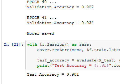
This screenshot shows after 41 Epochs the program was able to hit the required score of 93% and this gave a final score of 90% on the Test data set. I put a break in the program to stop when it hit 93% the same program can hit 95% at around 140 Epochs. But it can also fail to hit 95% even after 200 Epochs so I put in a cut off a 93% to make sure I handed up a project that would satisfy the reviewer.


Functional Safety
Path Planning
PID
Particle Filter
Unscented Kalman Filter
Kalman Filter

Vehicle Detection
Behavioral Cloning
Advanced Lane Lines
Finding Lane Lines
Going beyond the basic requirements:
The project had some bonus requirements if you had time before the deadline to try. These were to try some new unrelated roads signs to see how the program would cope and to display the patterns that the program was identifying as important featured to recognise.
The program scored 81.8% on the 9 extra images I added myself not part of the German Data set. This was interesting as I had deliberately selected some images that were diagrams and not photos to see how they would score. Both images and diagrams of the stop and yield sign were correctly identified with the image of the 30 kph road sign and roundabout ahead diagram consistently being misidentified. It was a reasonable performance on data that looked significantly different from the data set.

5 extra "Diagram" Road signs

6 extra "Picture" Road signs

This graphic is a representation of what the computer thinks the sign is and what it considers the next 5 most likely signs to be. In this case it is more than 80% sure the sign is children crossing and less than 10% sure it is a stop sign and nothing else is given any probability . Of course both guesses are incorrect. As the Epoch count goes up the computer gets more certain of its guesses and diagrams like this tend to show 100% certainty after more than 100 Epochs. It is funny that the computer can be 100% sure and still wrong. Maybe this is a sign of how like humans we have made computers? Do you know of anybody who thinks their 100% right when they’re wrong?

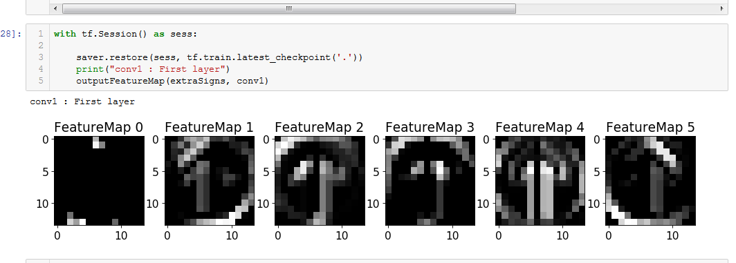
The beauty of machine learning and convolutional networks is that you don’t tell the computer what features to decide represent that road sign. We give the computer many examples and a label for each example. So we tell the computer “this is a stop sign” we don’t say a stop sign is red or a hexagon shape or has the letters S.T.O.P. etc we just say here is a stop sign. You can see below how the computer recognises patterns and starts to develop an idea of what a sign looks like gradually in the Feature Map images shown here.
